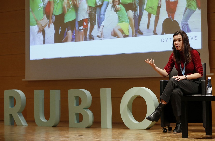
Spanish researcher Luz Rello has been unanimously awarded the European Young Researchers’ Award 2013 (EYRA), for which she was competing against fellow European PhD candidates across all disciplines.
While the award recognizes the level of her work and her personal qualities as a researcher, it also helps putting a valuable cause in the spotlight: Internet accessibility for dyslexics.
Besides its potential impact, one of the most interesting aspects of Rello’s research is that it occurs at the intersection between linguistics and computer science. As such, she based her experiments on tools borrowed from natural language processing (NLP) and human-computer interaction (HCI).
On one hand, she looked into how algorithms could be used to automatically replace words that are difficult for dyslexics with more common synonyms. On the other hand, she used eye tracking and facial expression analysis to find out what a dyslexia-friendly Web would look like.
While a handful of fonts are already made available as supposedly being dyslexia-friendly, this was the first time that HCI techniques were used to thoroughly test the impact of key interface design elements on a representative sample of people with dyslexia. The list of variables included in Rello’s experiment was very complete, ranging from character, line and paragraph spacing to font size and type, as well as column width, grey scales and color pairs.
Rello’s findings are summarized in an upcoming paper in which she details specific visual features that can make online reading much easier for dyslexics. For instance, she learned that the larger the font size, the better; ’18 pt’ seemed to be the optimal setting.
Moving on to font types, she concluded that italics tended to have a negative impact. Conversely, she observed that sans serif, monospaced and roman font styles significantly improved the reading performance. To name names, this means that Helvetica, Courier and Computer Modern Unicode are particularly good typefaces if you want to make sure your website is dyslexia-friendly — which is likely to please Helvetica fans.
PRUEBA EL TEST GRATUITO DE DISLEXIA